In my last article, I went through how I turned the raw GA4 export into a star schema with dbt. This one picks up where that left off, in two parts: first the Power BI semantic model that sits on top of the star schema, then the report itself and the design decisions that went into it.
I started by building the semantic model and did a draft report, and then used Anthropic’s AI, Claude, to help build the rest of the dashboards by giving it direct access to the report’s PBIP files. There’s a section near the end on how that worked, what went well, and what didn’t.
Quick disclaimer before anything else. This site is small. It’s had roughly 360 sessions in three years, and a good chunk of those are me: checking pages from my work laptop, my phone, or sending links to friends. So the numbers themselves aren’t the interesting bit here. The design is, and good design works the same whether you have 360 sessions or 360,000. Further to that, since the data is small, I did not need to do any performance optimisations on the semantic model.
Part 1: The semantic model
The dbt star schema gives us the foundation of how to build the model. Power BI then needs its own semantic model on top: which tables relate to which, which way filters flow, and how each metric gets calculated. I avoided adding custom logic within the semantic model as much as possible so that the model’s logic is managed through the dbt model itself.
Loading the data
I imported the data directly from BigQuery with no modifications in Power Query. If a table needs to change, it should be changed in dbt, gets tested there, and Power BI just picks it up on the next refresh.
Since the data is small, I can easily import the data. If I used DirectQueyr, I would end up incurring costs for querying BigQuery everytime the visuals are changed or filtered.
Relationships and filter direction
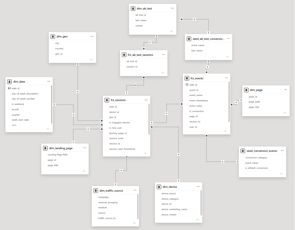
The sessions fact table sits in the middle. Date, traffic source, landing page, geography and device all filter sessions directly.
The events fact table is joined to sessions through the session key. This means any filter on sessions (for example, only Organic Search traffic in March) carries through to the events that happened inside those sessions.
The page dimension filters events directly.
Filters flow one way, from the dimensions into the facts, with one exception (see the A/B test section below).
The landing page problem
A page shows up in the model twice: the page an event happened on, and the page a session started on. Power BI only allows one active relationship between two tables, so I created the landing page as a second copy of the page dimension, as a calculated table inside the model. Each copy has its own relationship, so “Landing Page Path” in a visual means exactly that, without any relationship switching in DAX.
This can also be modelled out separately if needed by taking the landing page values directly from the landing page field.
A/B tests are many-to-many
A session can be part of more than one test, and a test has many sessions. To handle this, the A/B test sessions table sits between them as a bridge. This is the one relationship where I opted to allow filters in both directions, so that selecting a test filters down to its sessions. Two-way filters can make a model ambiguous if they’re used too freely, so I kept it to that single relationship.
Seeds as configuration
Which events count as conversions comes from a small seed file in dbt, and is flagged on each event. The A/B test version (which conversion event belongs to which test) is joined in Power BI. In both cases, changing what counts as a conversion is an edit to a CSV file rather than a code change. And since it’s applied in the pipeline rather than in GA4, it applies to the full history, not just from the day the setting is changed.
Measures in one place
All metrics live in a dedicated measures table: sessions, users, new and returning users, page views, bounce rate, conversion rate, pages per visit, and average engagement time. Format strings are set on the measures themselves, so a rate shows up as a percentage in every visual, without having to format each one individually.
Where to draw the line between dbt and DAX
The rule of thumb I ended up with is:
- dbt: labels, classifications, and anything another tool might need.
- DAX measures: ratios and distinct counts, since these have to be recalculated for whatever filter is applied. For example, you can’t add up bounce rates across channels, and you can’t count unique users per day and add them up to get unique users per month.
Part 2: The report
Where I started
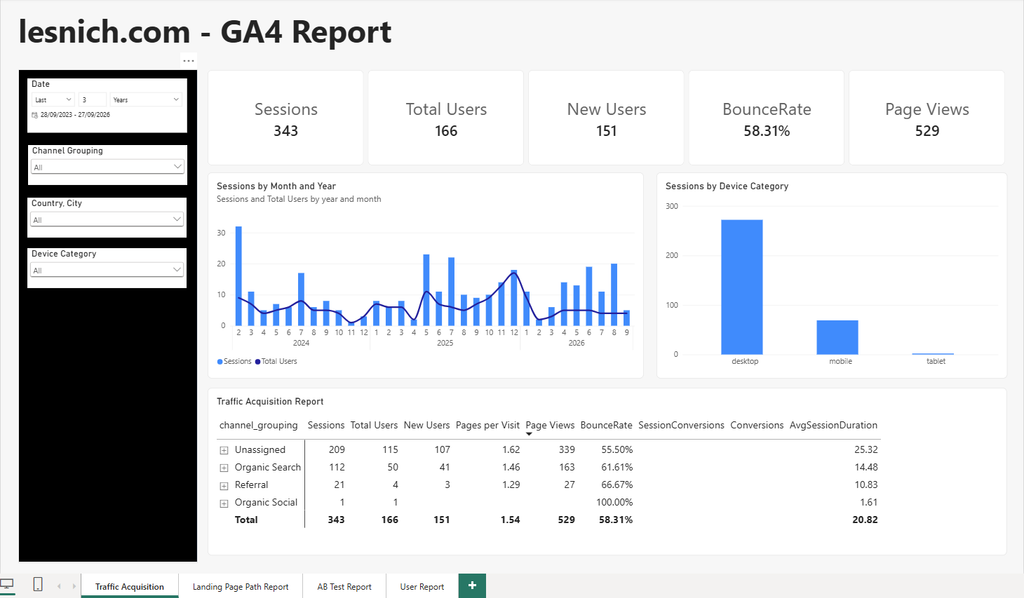
I started off by creating a basic report to validate that the data and the semantic model are set up correctly. I built the key pages that I wanted, which were the Traffic Source report, Landing Page report, the User Report, and the A/B test report page.
Bringing in Claude
At this stage, I thought of using Claude to build the report on top of the semantic model. Since the semantic model was already built, Claude could take the context of what each measure meant from there. I also provided Claude with the code and documentation of the dbt model to help further inform the design decisions. There is more detail on how I did this further down.
I then asked it to redesign the dashboard but using the existing semantic model as is with no changes. After a few minutes, Claude came back with a fully redesigned report that was consistent in design throughout.
One layout for every page
The biggest change was picking a single layout and using it on every page:
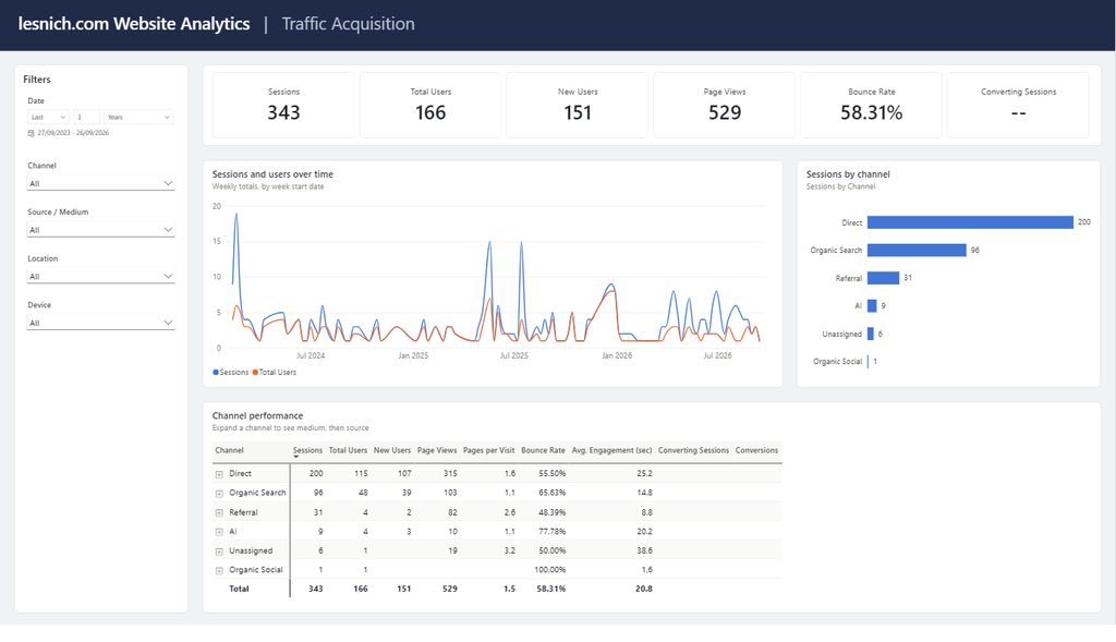
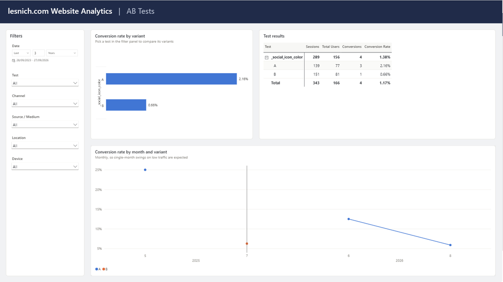
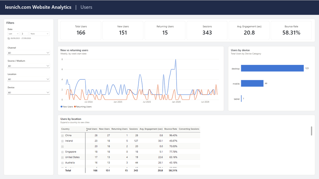
- Header: a navy band across the top, clearly stating what the report is (lesnich.com Website Analytics) and which page you’re on.
- Filter panel: on the left, with the same filters in the same order on every page: date, channel, source / medium, location, and device.
- Content: reads from top to bottom, going from overview to detail. Headline numbers first, then a trend and a breakdown, then a detailed table at the bottom.
The last point is the most important one in my opinion. If someone only has five seconds, the numbers at the top should answer “how are we doing?”. If they have five minutes, they can work their way down the page to answer “why?”.
A theme rather than formatting every visual
Rather than formatting each visual by hand, I set up a custom theme file. It controls the colours, fonts, cards, tables, and filters across the whole report, so every new visual starts out with the right formatting. I went with a deliberately simple look, with white cards and a thin border on a light grey background, so the focus stays on the data.
The colour palette is colour-blind safe, and the order of the colours matters:
- The first two colours (blue and orange) stay easy to tell apart for the most common types of colour blindness, so any chart with two series uses those two.
- Colours follow the thing they represent, not their position. If a filter removes a series, the remaining ones keep their colours.
Chart choices
- No dual axes. The sessions and users combo chart is the classic example. Two y-axes with different scales make it look like the two measures relate to each other in ways they don’t, and where the lines cross depends entirely on how each axis is scaled. Sessions and users are both counts, so they can share one axis on a simple line chart.
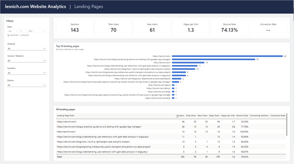
- Top 10 rather than a colour per page. The landing page chart became a sorted bar chart of the top 10 landing pages by sessions. A colour per landing page stops working after five or six pages, since nobody can match twelve shades back to a legend. The full list is in the table below it.
- Sorted bars with labels. Bar charts are sorted from largest to smallest, and show the value on each bar rather than relying on an axis.
- Weekly trends, for now. The trend lines use the week start date rather than the month. This is because my date dimension stores the year and month as numbers, so a monthly axis reads “2025 1”. The proper fix (a month label column) belongs in the dbt model rather than in Power BI, so weekly trends will do until then.
The report pages
- Traffic Acquisition: where visits come from. Headline numbers (sessions, users, new users, page views, bounce rate, and converting sessions), sessions and users over time, sessions by channel, and a channel table that can be expanded into medium and then source.
- Landing Pages: which pages users land on, and what they do next. The top 10 landing pages, plus a full table with pages per visit, bounce rate, and conversion rate for every landing page.
- A/B Tests: conversion rate by test and variant, a results table, and conversion rate over time for each variant, with an extra searchable filter for picking a test. To be fully honest, this page is mostly empty. There’s been exactly one conversion across all my tests in three years, and it was me checking that the tracking worked. The page is built for when there is data.
- Users: who is visiting. New and returning users over time, users by device, and a location table by country and city. The original version of this page repeated the traffic acquisition table, so I replaced it with something that answers questions about users.
Designing the report exposed problems in the model
This was the part I didn’t expect. Reviewing the report properly, rather than just checking that the numbers were there, exposed a few issues further up the pipeline:
- tagmanager.google.com was showing up as Organic Search. My channel rules checked whether the source contained “google” anywhere, so a referral from Google Tag Manager was treated as a search engine. The fix was to match the search engine’s own domain, rather than any source containing the word.
- AI tools needed their own channel. GA4 now has a default AI Assistant channel, so I aligned my rules with Google’s, and added a fallback list of AI sources to catch older sessions and tools that aren’t on Google’s list.
- (not set) traffic. Most sessions with no source and no medium were ending up as Unassigned. I opted to class them as Direct instead. This is a deliberate departure from GA4’s default, and it’s documented as such in the model.
- A searchable source / medium filter needed a combined “google / organic” column. I could have added a calculated column in Power BI, but it’s a standard GA4 dimension, and anything else using the model would need it too, so I added it in dbt.
- Formatting and a missing measure. Rates and averages got proper format strings in the semantic model, and I added a Returning Users measure, since new vs returning users is one of the first questions a user report should answer.
Each of these fixes went where it belonged: classification rules and labels in dbt, and calculations and formatting in the semantic model. This is the same split I described in Part 1.
How I built it: Claude and a folder of JSON files
I built the first version of the report and the semantic model myself, including all the measures. For the redesign, I worked with Claude Code (Anthropic’s AI coding assistant). I want to be upfront about how that worked, since the approach itself was part of the experiment.
The approach
Power BI can save a report as a PBIP project instead of a single .pbix file. In this format, the report and the semantic model are folders of text files. Every visual is a small JSON file, and the model (tables, relationships, and measures) is written in a text format called TMDL. This means an AI coding assistant can read and edit a Power BI report in the same way it edits code.
I’m aware there are MCP servers that let an AI assistant connect to Power BI more directly, but I deliberately didn’t use one. I wanted to see how far I could get by giving the assistant access to the project files and nothing else.
How it went
- Claude read the whole semantic model and every visual file, then gave me a plan: the layout, the theme, which charts to change, and a list of things it thought could be improved in the model. It flagged the model changes rather than just making them, and I decided which ones to approve.
- It built the first page, then stopped and asked me to open the report and check it before rolling the design out to the other pages. This checkpoint was important: if a formatting setting had been wrong, it would have been wrong in one file rather than forty.
- Once I was happy with the first page, it built the rest of the pages, the theme, and the model changes. The report opened in Power BI without any errors.
What worked well
- Consistency. Every page uses exactly the same positions and spacing, since they were all written from the same numbers rather than positioned by hand.
- Seeing the whole model at once. Reading the model as text made it easy to spot things like missing format strings, and to question whether a relationship was filtering the way I expected.
- Following a problem upstream. When I spotted Tag Manager sitting under Organic Search in the report, Claude traced it back to the channel rules in my dbt model and fixed it there, rather than patching it in Power BI.
What didn’t work as well, or needed me
- It can’t see the report. It edited files it had never seen rendered. It was open about which formatting settings it was less sure of, and relied on me to open the report and tell it what I saw.
- The report has to be closed while the files are being edited, otherwise Power BI can overwrite the changes when it saves.
- Some things can’t be done through the files, such as syncing filters across pages, so I finished those in Power BI Desktop myself.
- It got things wrong. It told me GA4 has no default channel for AI tools, and at first named the new channel just “AI”. GA4 does have one now (AI Assistant), so I corrected it. It then checked Google’s documentation and updated the model to match.
- The judgement calls were mine. What belongs in dbt versus Power BI, treating (not set) traffic as Direct, and which fixes to make now versus later were all my decisions. The channel issues were also things I spotted in the finished report.
Would I do it this way again?
For a redesign like this one, yes. Working on the files directly is fast and repeatable, and every change is a plain text change that can be reviewed. The trade-off is feedback: without an MCP, the assistant can’t query the model or see the values in a visual, so the checking falls to you. Comparing the two approaches properly is something I’d like to try next.
Current state and next steps
The report is built on the star schema and working. There are a couple of things I still plan to add:
- A Page report. This was one of the requirements from my last article: the same idea as the Landing Pages report, but covering all pages viewed rather than just where users landed.
- A month label in the date dimension, so that monthly charts read “Jan 2025” rather than “2025 1”.
You can find the repository with the dbt project here: https://github.com/lvasmt/ga4-dbt-pipeline
The takeaway
A report is the part of the pipeline people actually see, so it’s where any earlier shortcuts show up. The layout and theme took the least time. Most of the time went on the questions the report raised: why is Tag Manager a search engine, how should I handle (not set), and does this chart accurately reflect the data behind it? In a way, building the report was the last round of testing for the model.
Leave a Reply